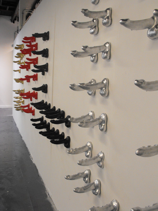
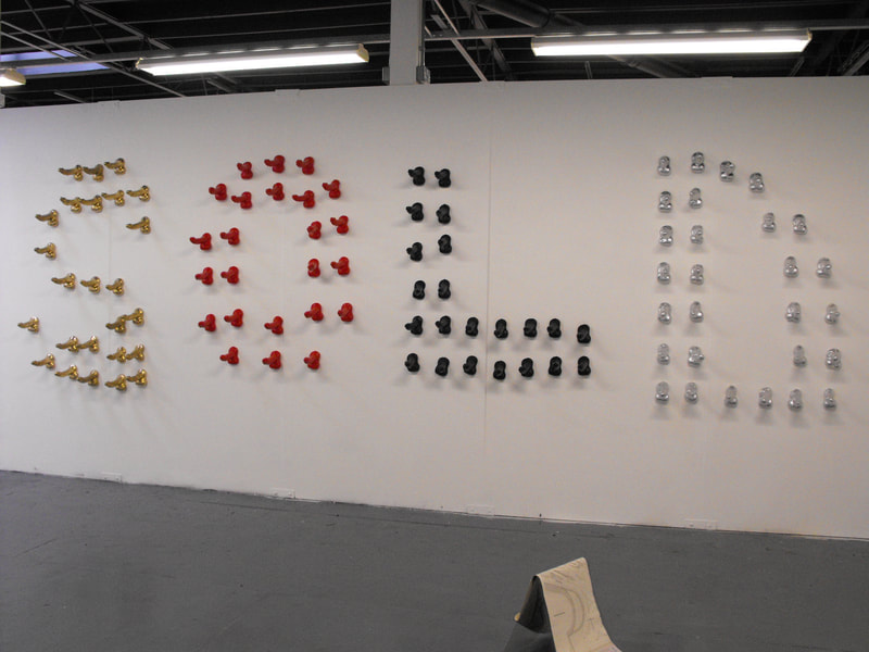
Exploring the relationship between the body and the brand, looking at how consumerism becomes part of us physically as well as mentally. The work examines this through a physical representation of the brand, with the body being ‘branded’ with words such as Gucci, Prada and Chanel. The work shows a human scale, generic form of male genitalia, the sexual organ is being used to highlight the underpinning of advertising, which the aforementioned brands use. The reason for using to scale objects is to allow maximum relatability from the audience. I am exploring the way in which a brand can imprint on the public, and I am transposing this concept onto my work, with the intention of leaving a lasting effect regarding the use of sex through visual media.
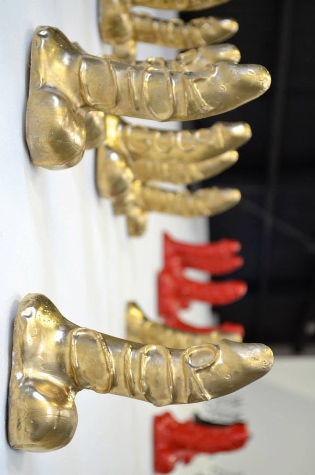
This piece brings together a mixture of materials which are not normally associated with the body, for instance the phallic form is made from plaster, which is not pliable or allows movement. The brand name is embossed on the side of the form and is only slightly raised from the surface, adding subtleness to the work. This technique is also used on branding cattle providing a means to identify the animal’s rightful owner. The idea of ownership and belonging can also be associated within our society and clothing brands. Branding can also be seen in H &M’s short commercial film featuring David Beckham being stripped of his clothing until he is left with H & M branded underwear. In addition, these brands use embossed brand names on their packaging and I wanted to represent this concept of people being branded by the product. I feel this is a key element of advertising and I wanted to draw this out for this piece of work.
There is an even number of phallic forms in order to produce a piece that is symmetrical and proportioned. There was further influence from the formation used of bright bold lights to advertise Broadway musicals to glamorise and appeal, in the same way as advertising glamorises their products. The pieces together are sprayed a particular colour, which is associated with the specific brand name; for instance, Gucci and Dior both associate themselves with the colour gold, in response to this I will be spray painting the phallic forms the colour the brand associates itself with. The spray paint is applied in a careless manner, leaving the work not finished to a high standard, unlike many of the advertisements, to represent the way in which sex is routinely used as a seedy approach in promoting the product. In addition, the piece has an appearance of uniformity and polish from a distance; however, as the audience engages with the piece and looks closer there is a dubious feel to the individual elements that make up the piece. This parallels advertising, as the overall slickness of advertising glosses over the reality of exploiting sex in order to sell.
Theory has been the key to understanding this area of pop culture. Bringing in feminism as well as desire, I have read Fragmented Fetishes: Monstrosity and desire in women’s contemporary time based art by Jenny Keane, Looking on by Rosemary Betterton, as well as Practices of Looking: Consumer culture and the manufacturing of desire by Marita Sturken and Lisa Cartwright. These texts discuss consumer culture and desire from a female point of view, exploring the male dominance and input in consumerism. Artists I have researched have consisted of Helmut Newton, for his use of fashion and female representation within the industry. Sarah Lucas’s works ‘Situation’ for her deliberate clumsy and slap dash approach. In addition, Linda Benglis’s advertisement for her exhibition, which appeared in ArtForm, was also sourced as an influential piece. Finally, Pierre Molinier, who explores female identity from a male perspective, using himself as the subject matter, turning certain body parts into androgynous forms, he lets his audience determine the gender of the work.


